
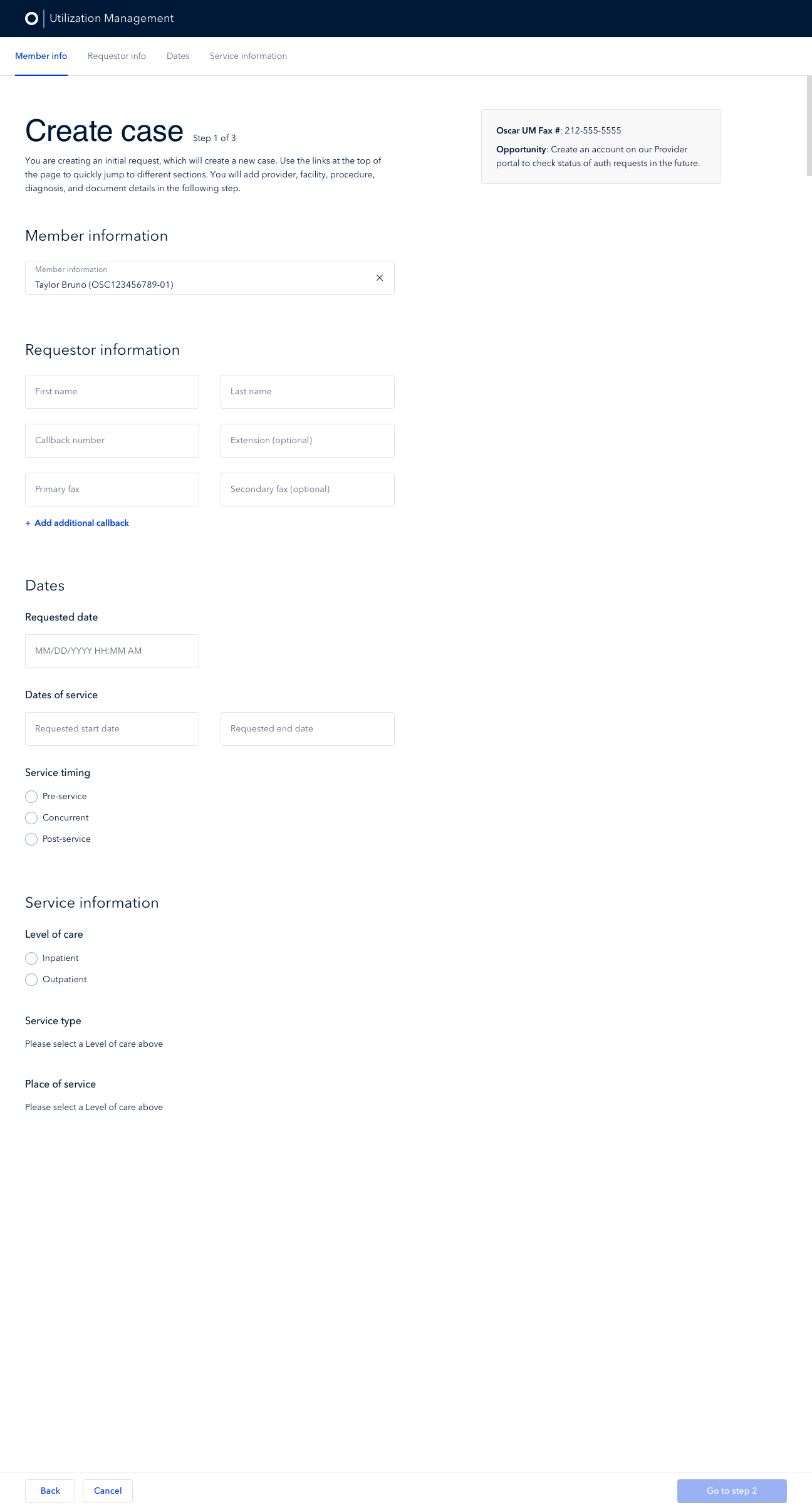
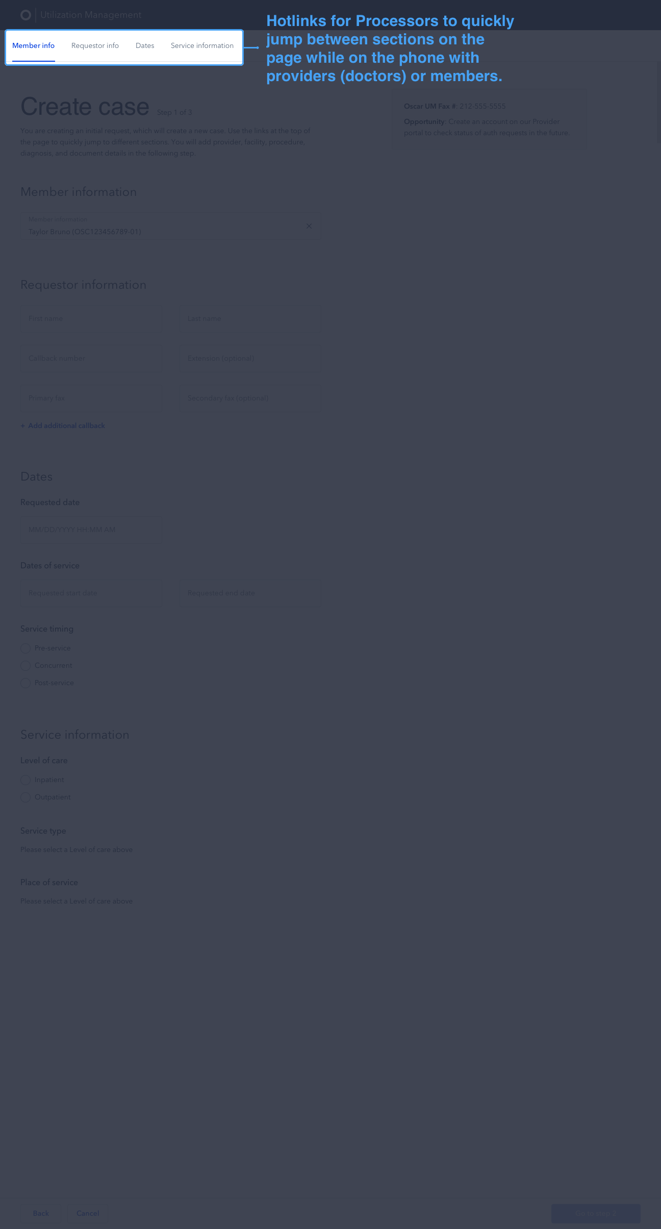
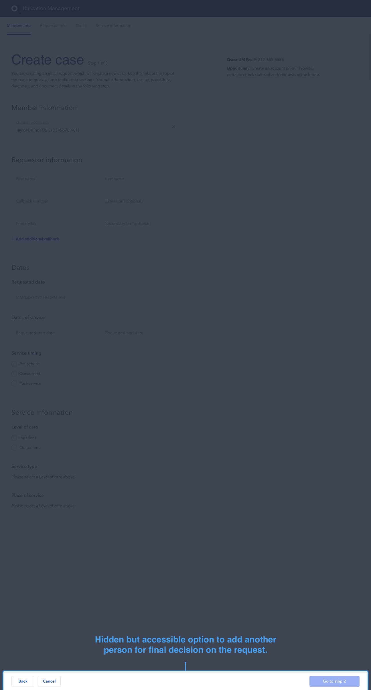
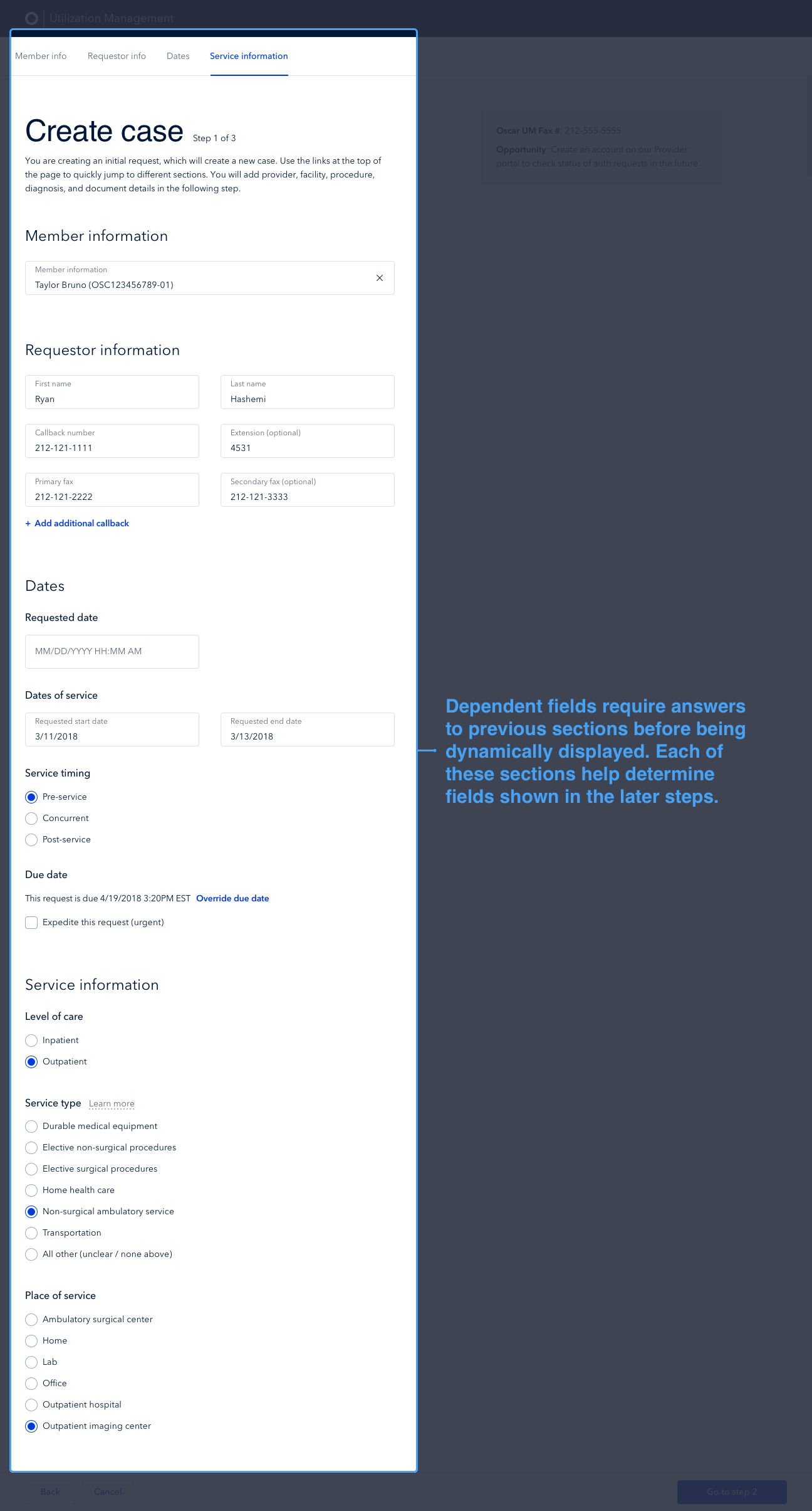
Internal Tools
Role
Senior Product Designer
Tools
Sketch, Invision, OptimalSort, Jira, Principle, Google Drive
Date
October 2017 - March 2019
Brief
While at Oscar, I collaborated with product managers, engineers, and business stakeholders to tackle complex challenges on Oscar’s internal tools. I built platforms from scratch for Utilization Management, Eligibility & Billing, Telemedicine, and Provider Services.
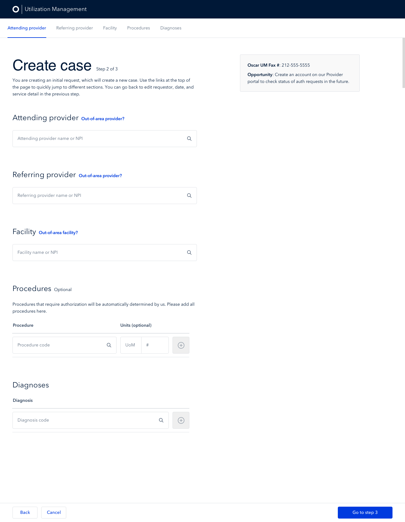
Utilization Management
“Utilization” refers to how much healthcare a member uses each year (ie - how many times a member goes to urgent care or undergoes an operation). Oscar’s Utilization Management (UM) team consists of a group of processors, nurses, and physicians dedicated to getting members access to the right care (most medically appropriate and cost efficient) by authorizing necessary treatment. The UM team was using multiple siloed systems to track and manage authorization requests, resulting in time consuming and inefficient manual data entry.
The UM team’s output directly impacted medical loss ratio (MLR), a highly regulated, key measure of a healthcare company’s efficiency. Reducing MLR was a major focus for Oscar to remain compliant and competitive in new and existing markets. The lower the number, the better. By optimizing the UM team’s workflows, we would not only reduce MLR, but we would also enable better reporting and reduce fines due to human error.
We created a new utilization management platform within the claims system that creates one simple tool to help our UM Team process authorization requests. It does this by standardizing intake and clinical review forms, centralizing requests and decisions by case, and automatically pushing authorizations and decisions into our claims system for auto-adjudication.
We reduced the volume of authorizations by 8,500, or 72%, decreasing paperwork and freeing up more time for providers to be with their patients.


Goals
1. Facilitate reporting by standardizing where and how data is stored
Subsets of information were siloed across tools
Standardized reporting was nearly impossible
Challenging to measure utilization over time
Annual audits were extremely time consuming
2. Reduce reliance on manual data entry and streamline workflows
Workflows spread across Jira, Google Sheets, internal Oscar tool, and more
High-paid team of in house clinicians spent much of their time doing administrative and manual tasks
Copying and pasting information across tools was time consuming
Manual data entry was error prone
Time could be better spent with members
Constraints
High-risk project that could not be released in parts
Because of the way we generated reports on this extremely important and costly part of the business, we could not afford to do that reporting in 2 systems.
We had to make the jump from the old way to the new way of doing things in one go without an easy way to roll back in case something catastrophic went wrong.
Validated our solutions through user testing as much as possible, but ultimately there would still be a risk in the changeover.
Negative potential impact on members not being able to get access to care when they needed it
If the system did not correctly map over all workflows and existing statuses, our members would not be able to submit authorization requests, which could mean the literal lives of our members could be in jeopardy.
Role
I was 1 of 2 designers on Oscar’s internal tools teams with a broader design team of 10 people.
Each designer on internal tools was responsible for owning a subset of our internal teams.
I led Utilization Management, Provider Services, Eligibility and Billing, and Telemedicine.
I constantly worked with new product managers, engineers, and business stakeholders, as well as new processes, timelines, users, and knowledge areas across the many internal tools teams.
Our goal was to increase the efficiency of our internal teams, ultimately saving the company thousands of hours or work and money after each product launch.
1 Senior Product Designer (me)
1 Senior Product Manager
2 full stack engineers
1 backend engineer
1 front end engineer
3 primary business stakeholders from 3 different teams
Timeline
6 weeks of heavy design work in Q2 2018
Phase One (2 weeks) included partnering closely with product manager and tech lead to identify opportunities, goals, success metrics, and to begin shadow sessions, competitive research, and user testing.
Phase Two (1 month) involved iterating on design explorations, testing with users, and reviewing progress with all stakeholders. The engineering team began laying the framework for the product.
Phase Three (3 months) engineering team began building the front end, releasing in pieces to allow early testing
Phase Four (2 months) released a pilot version that 2 users tested, ensuring no major workflows were missing or broken. We addressed any bugs or UX issues during this time.
Phase Five (2 months) involved launching the product and closely monitoring for feedback. We collected suggestions, bugs, and more and prioritized and addressed each item every week.
Key Learnings
Maintain constant communication with key stakeholders + team
Throughout the quarter long design work we held bi-weekly stakeholder check in updates where we shared accomplishments, key learnings, open questions, and blockers. This helped facilitate the design process and ensure solid communication throughout.
Break large projects into key workflows
The sheer number of tasks the UM team completed, the amount of data needed, and the speed at which decisions needed to be made were daunting. Beginning by breaking the project down into workflows and evaluating which were most common helped us evaluate where the key points of the application would live.
Research
I shadowed some of our UM nurses and processors to get familiar with their workflow and the tools they use, helping to uncover pain points and allowing me to form hypotheses about how we can alleviate them. One of those pain points was finding related request information, such as past decisions or clinical criteria, and tracing its activity over time. Since we were primarily doing reviews in Jira, any modifications or decisions were tracked in “tasks” or child tickets of the parent Jira ticket, rather than in the same place as the initial request, forcing the nurse to dig through multiple pages to get a holistic picture. Our fix: a clearer request hierarchy where all activity on a request is visible in one place.
Ideation
Together with the product manager and tech lead, we spent time whiteboarding and sketching workflow diagrams to fully understand the breadth of the work the UM team did. With so many possible workflows to tackle, we picked one focused on processors who were manually transcribing data typically from faxed intake forms into our digital systems (Jira, Google Sheets, etc). A processor’s typical workflow went something like this:
A processor creates an authorization request manually, based on a clinical document and intake form that is faxed in to Oscar, then moves the request to the next stage in the process (“nurse review”). Previously this one step happened in 3 separate tools.
A nurse then looks at the clinical documentation submitted, reviews federal clinical guidelines, and makes a determination.
Once the nurse has reached a decision, they write their review, document the criteria they referenced, fill in some other information about the request, and submit the review (previously this all happened in Jira).
The processor then communicates the decision on that request to the provider.
Collaboratively sketching out one of the many workflows with our users
The final lifecycle of a Request as broken down by user type (processor (black), nurse (green), physician (blue)) and the various stages it can go through in the more complex scenarios.
Blank Canvas
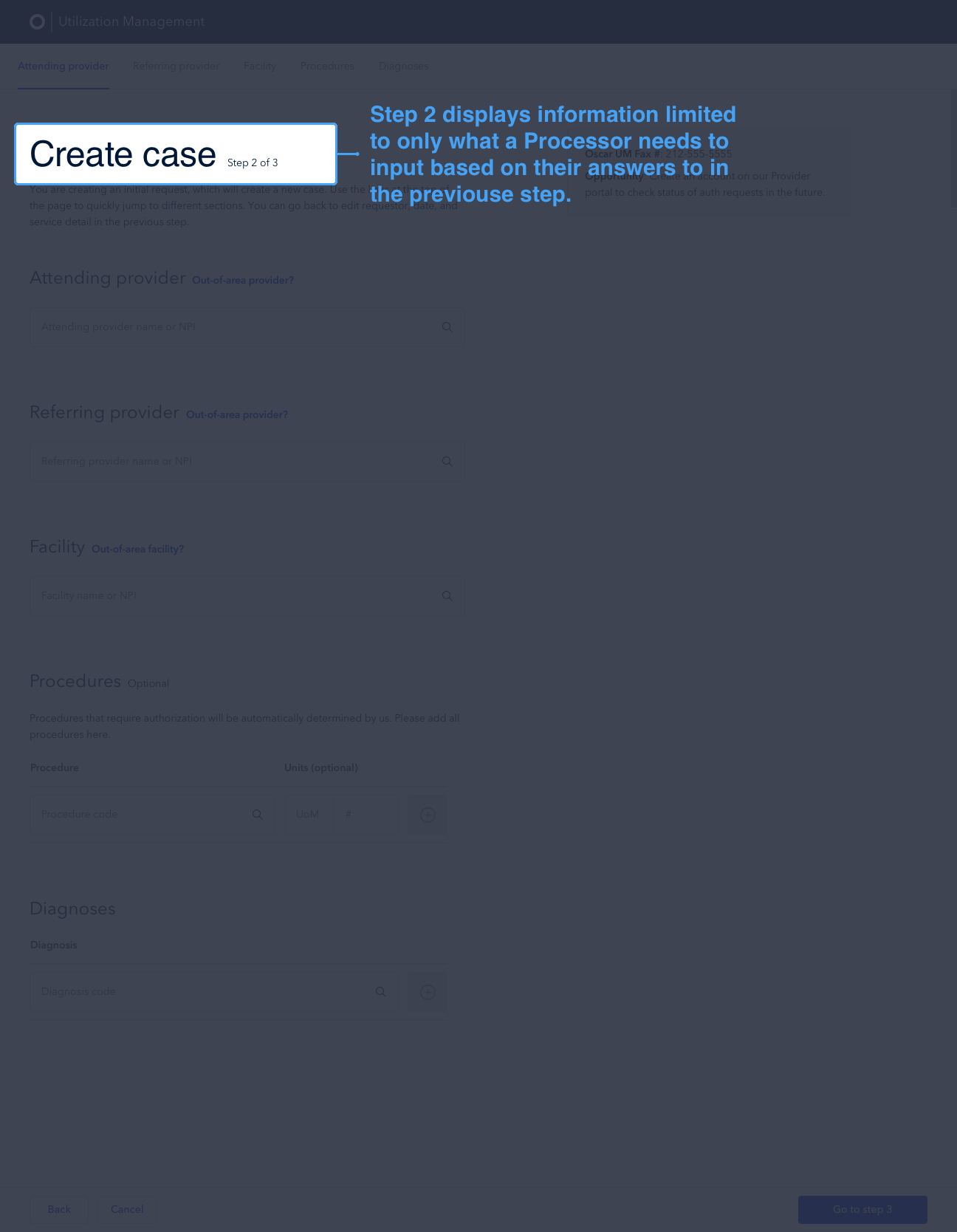
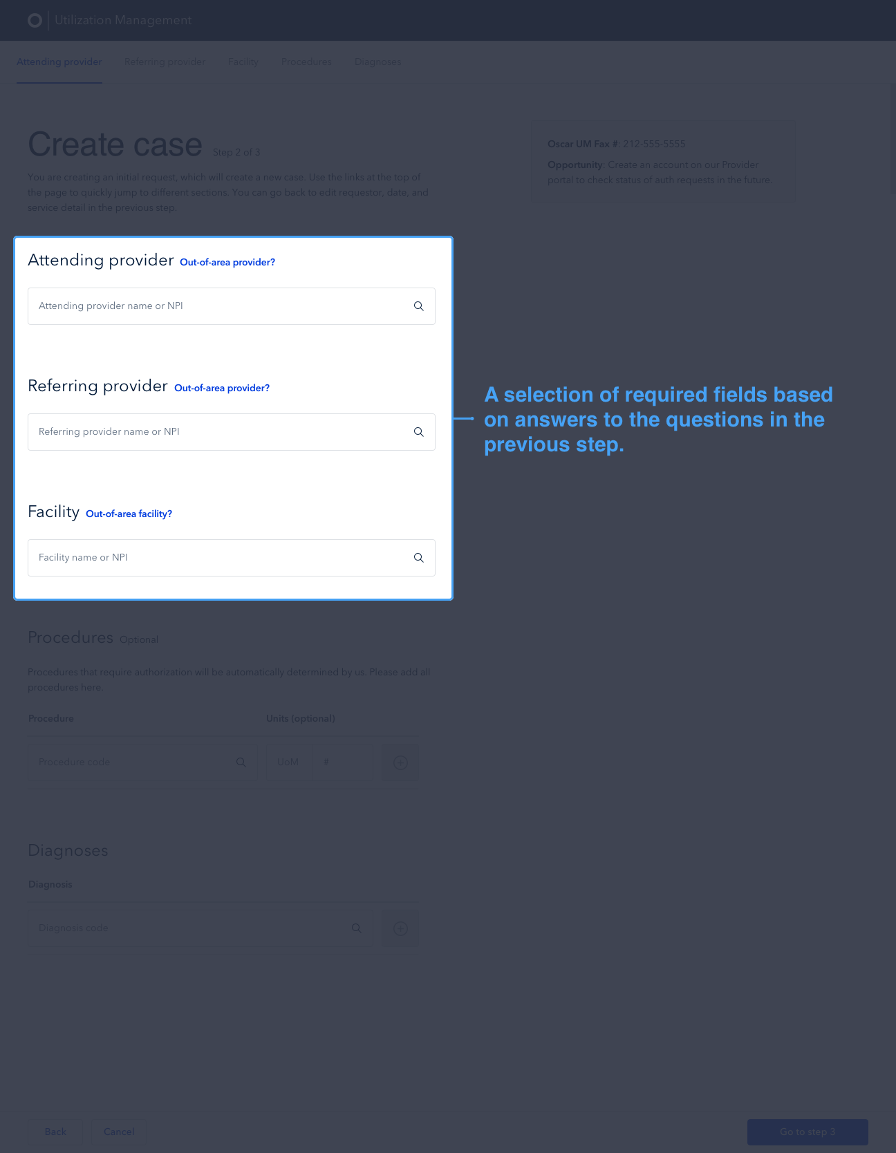
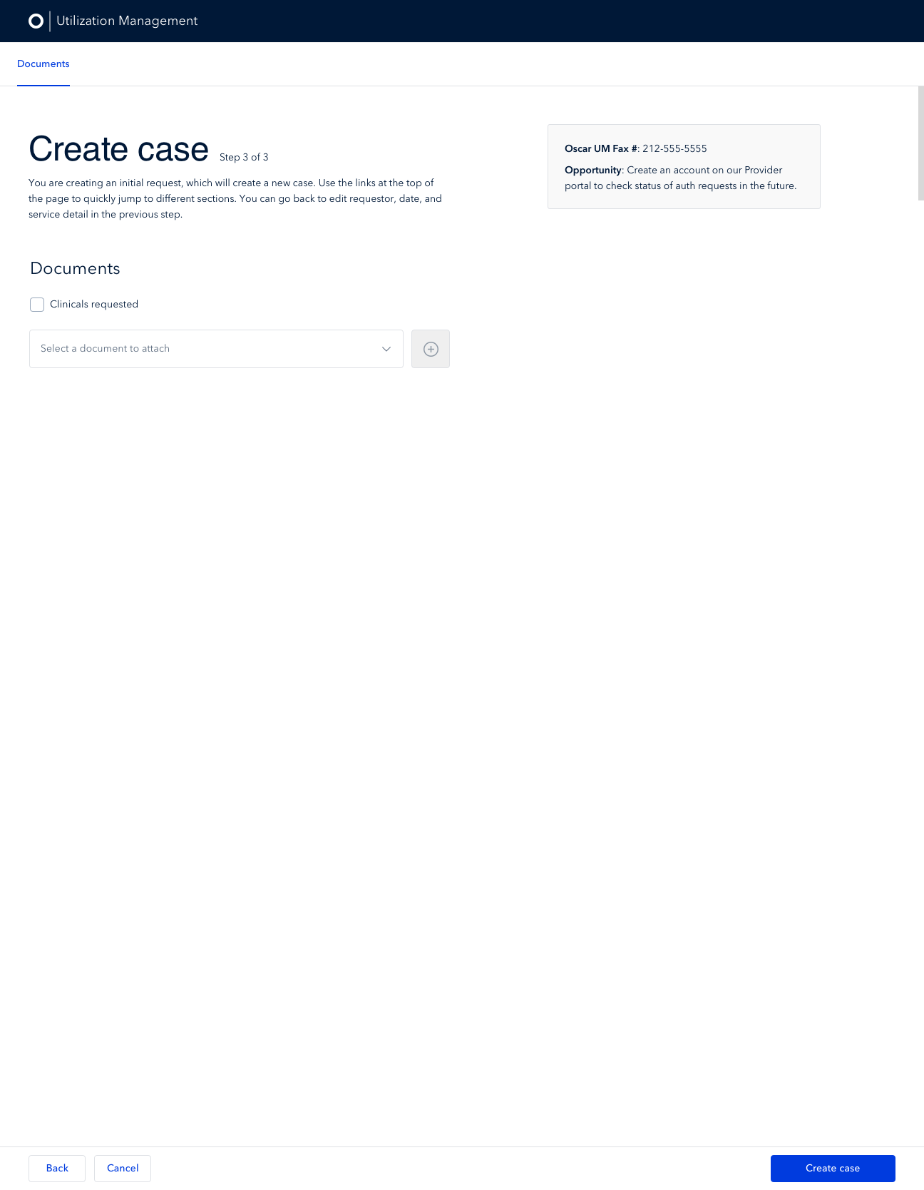
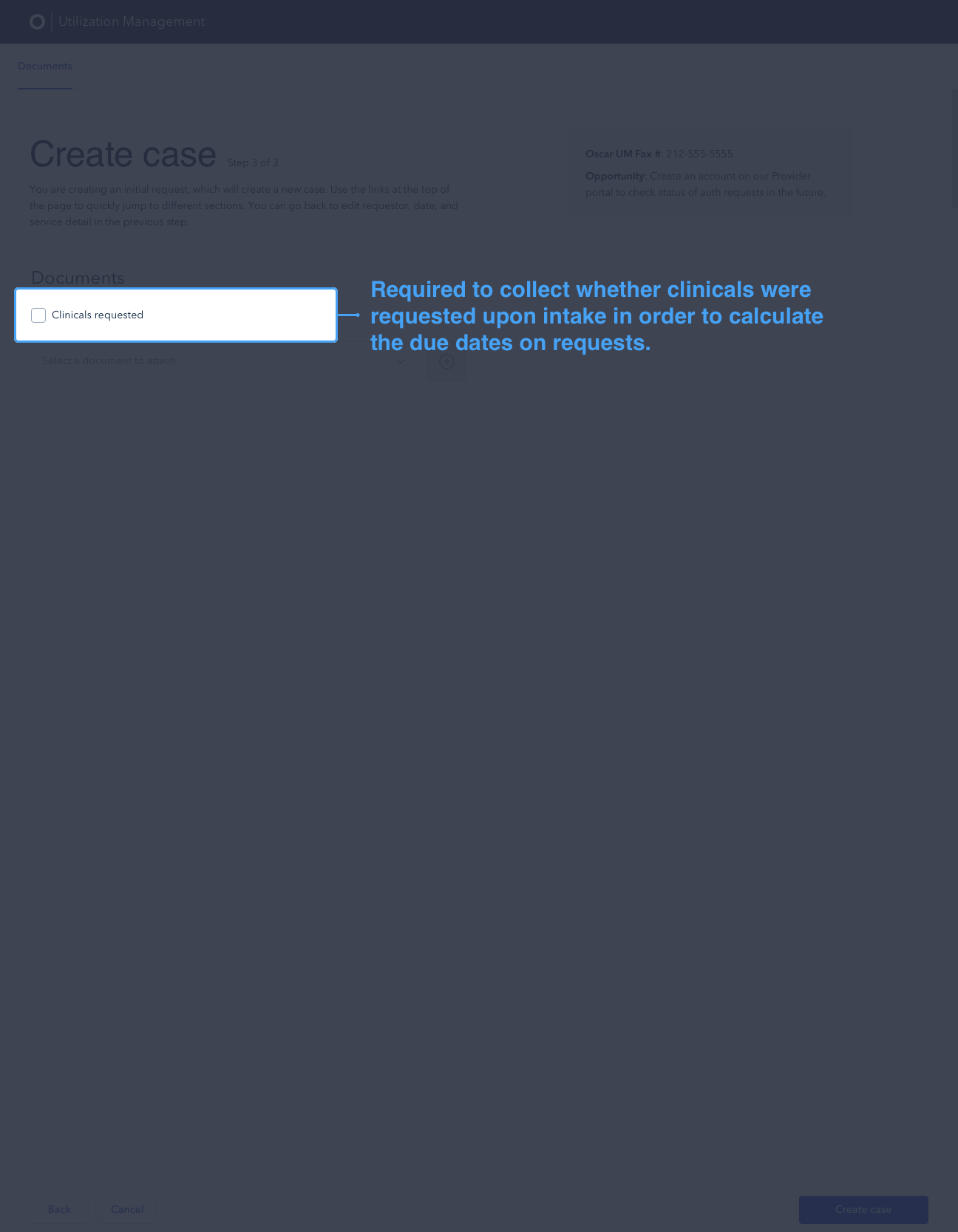
After sketching out all workflows, it became clear that there were a few key features, including an intake form, the ability to do a clinical review, and read-only request information, that, once created and designed, would ease the process for the rest of the application. I started with the intake form, exploring high level layout options to display the information needed. We weighed the pros and cons of each with other designers, engineers, users (processors in this case), and our UM stakeholders. Additionally, I led card sorting exercises to identify what information was most important to display and how we might consider grouping that information.

Exploring layout options in low fidelity

Card sorting exercise with users to determine information type and hierarchy
Atomic Design
While I explored higher level layout options, it became clear that inputs and dropdowns would be a big part of the UM tool. I began fleshing out how our input components might work so that even on dense pages with many fields for users to fill in, the page would not feel overwhelming. I iterated on these fields a number of times throughout the project and worked with the rest of the Oscar design team to make some tweaks to our existing design system components to better work within the internal tools realm.
Exploring the various states of our various inputs and dropdowns.

Exploration of the various ways we could show information in the header across the UM tool.
Determining Hierarchy
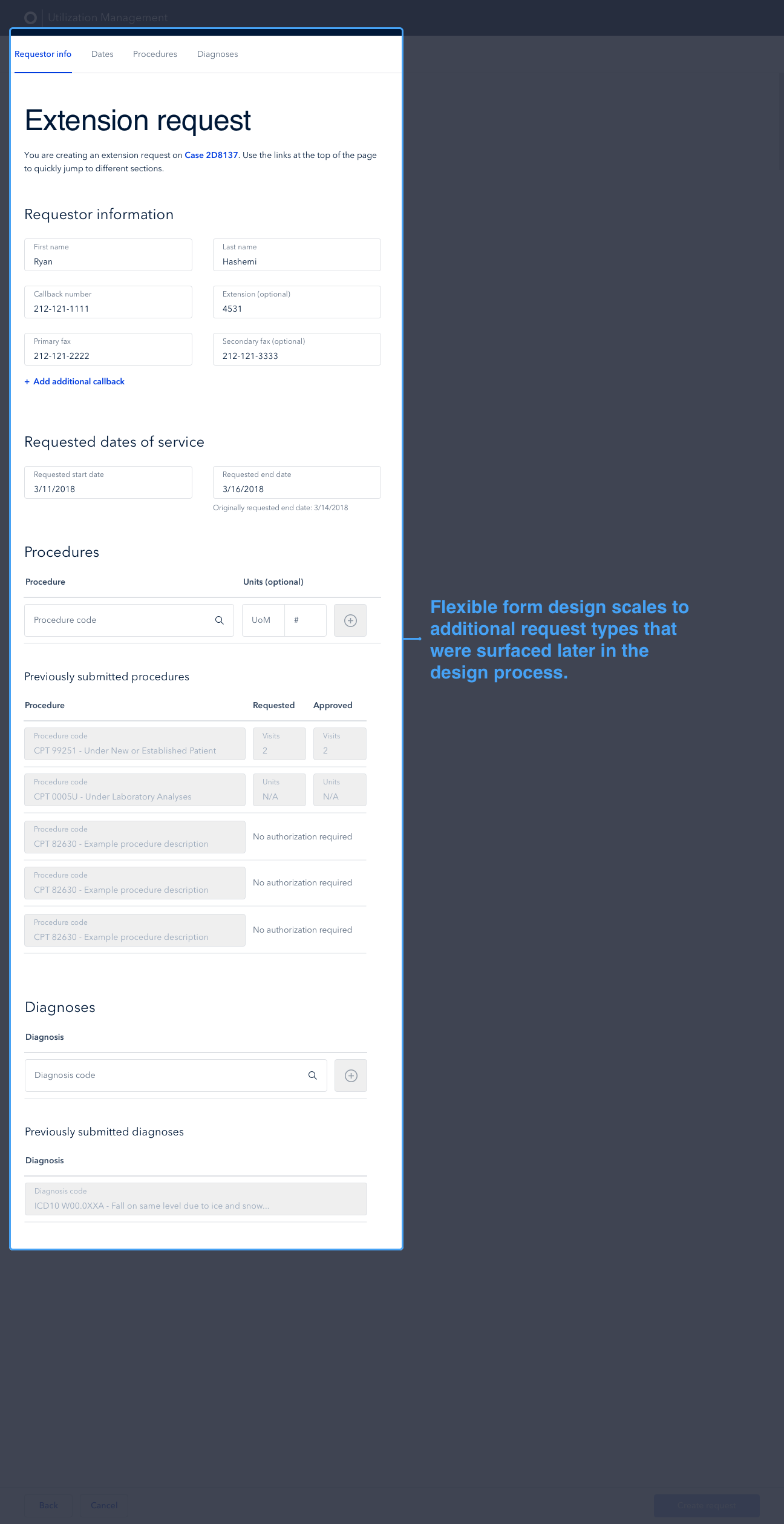
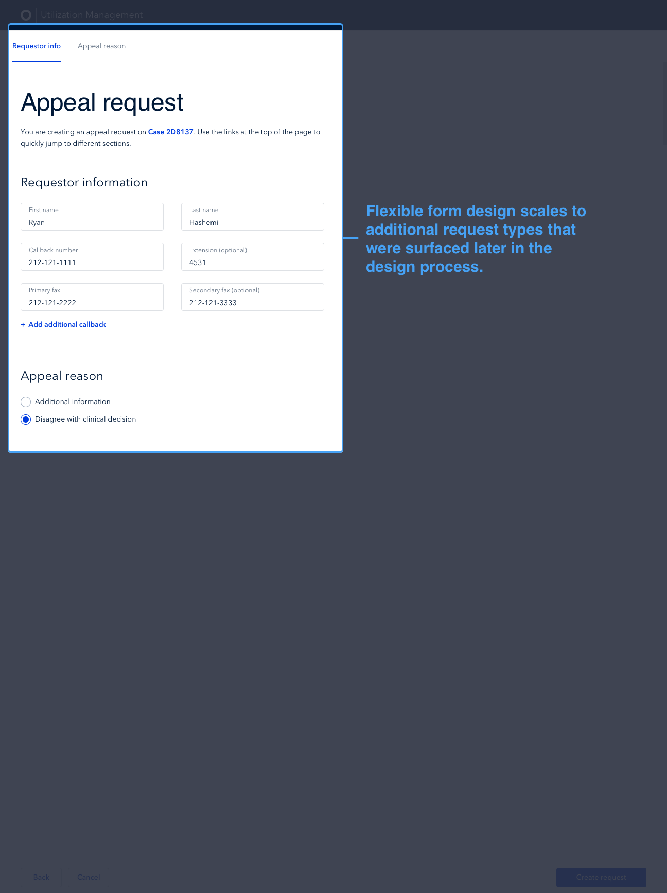
While thinking through the various aspects of the UM tool, the hierarchy of terms and components became central to how we continued progressing through designs. “Requests” were technically part of a “Case” and a person could have multiple “Cases” in an “Episode” (Episode > Case > Request). In some of my early explorations, I had framed creating new issues as creating Cases, which complicated the hierarchy. A new request would automatically create a new case and so users would not have to create both. The exploration below, while not visually very different, shows my thinking when it was case-centric before we evolved to a Request-centric model.

While not visually very different, our shift from a Case-centric model to a Request-centric model to make the hierarchy more simple for users paved the way for the rest of our project.
Iteration
After ruling out a handful of high level layout options, I moved to high fidelity design, taking advantage of our mature design system to quickly piece together the remaining layout options. Having a more detailed look into how the data would be presented helped us work with the team to more clearly identify their needs. We tried using a person panel, a slide out shelf, in line review, split screen, and a combination of these layouts. We created clickable prototypes and tested with multiple processors, nurses, and MDs so that they could provide feedback and help narrow down our options. I repeated this process a number of times as we got closer to “final” for certain pieces.
Tested using a left-side “person panel”, a slide out shelf, an in line review, a split screen, and a combination of these layouts for our main Request page.

We settled on a dynamic layout that would shift to take only half the screen while the user was in “Review mode” so that they could easily reference information on the left side of the screen as they completed their review (a process that could take anywhere from 10 minutes to 2 hours).

Each week, I put together a slide in preparation for Design Critiques to help focus the conversation and give my teammates an idea of the stage of design I was in and the type of feedback I was looking for. This is an example of one week’s Critique prep.
Circling Back
After repeated design, testing, and iteration brought us to a near final design on the intake form, I moved to the next key feature, the request information and clinical review action, and repeated the whole cycle again. It was important to break the key features into steps so that the engineering team could start building in pieces, allowing us to surface any issues before the inevitable crunch time closer to launch.
This close collaboration with the engineering team helped us figure out ways to cut scope. For example, we had new inputs that we wanted to use, but that would require a custom build out for the “read only” view of the input. Rather than build out a new element, we opted to use our “disabled” input as the “read only” version of the input, which saved significant engineering resources, despite the fact that the design was not as clean. Working on internal tools often means making calculated sacrifices on the style side in favor of releasing more data-heavy tools quicker, enabling the team to be more efficient sooner.

Constant feedback gathering throughout the project
The ideal read-only version of the Request page (left) as compared to the actual, easier to build version of the Request page (right). Given the limited engineering resources we had, we opted for the easier, quicker path in this scenario.
Pilot & Flex
Due to the nature of internal tools projects, it’s important to keep a fluid design process that can change at any moment. We were not able to do a partial roll out of the new tools because of the way we did reporting, meaning we had to do a full launch and cut over to the new product at one point in time. We tried to work around this as much as possible by launching a pilot where a small percent of users create dummy tasks in our new tools mimicking what they would’ve created in their old tools to see where the sticky points are or if we need to make additional changes.
With the UM tool, we did a 2 month pilot, during which time we designed and built some “fast-follows” to address bugs and usability issues. Remaining flexible and ensuring that we spend enough time getting feedback once the tool is “ready to use” is a necessity, especially because the teams we are building internal tools for are so crucial. Adding mere minutes to our internal users’ workflows not only impacts efficiency gains, but could also result in our members feeling the pain as well if we are slow to authorize procedure requests or answer a telemedicine visit.
Final Version
We iterated on hundreds of solutions over a few weeks, bringing us to a more solid final product and saving hours of engineering time by ensuring we were building the right solution. As a designer focused on internal tools, I love approaching new products like this because it means I get to meet more of the great teams at Oscar, flex my organizational skills to manage such a large project with many different users, and design solutions that enable us to scale.

The intake form for new requests used by processors & the resulting request page with information from intake form and clinical review actions
Post-Launch Iteration
After officially launching the new UM tool, I moved on to another internal tool team focused on building the “NextGen” tool for our member eligibility and billing operations team (“Elbow”). During that time, I noticed certain synergies in the way Oscar refers to and makes changes to members and their eligibility between UM and Elbow. In my spare time, I took some of the new components I had designed for Elbow and repurposed them for UM so that one day we might have one internal tool that could work for many teams and workflows.
I left Oscar before we got to work towards this implementation, but did review the work with the UM product manager, engineers, and stakeholders to get alignment.
Future exploration of how the UM tool could evolve given learnings I took from my work on other internal tools teams that I worked with after my time on the UM team.
Project Organization
The sheer size of this project and the many teams, workflows, and meetings involved led me to experiment with creating a Trello board that acted as a project database for my own reference throughout the project. I kept all meeting notes, key decisions, open questions, and important reference documents up to date in this board so that at any point throughout the project the board could be used by myself or someone else joining the team to get up to speed quickly.
Organization is near and dear to my heart (see the Skillshare courses I teach on Organizing Your Life here) and I’m always trying out new methods to keep myself organized. This method worked for me and I now do something similar for all larger projects I work on.

I kept track of all meeting notes, reference materials, key decisions, and open questions in a Trello board throughout the project.
Compliments
January 2018 - Rohit (PM): "Your Product Demo Day presentation was awesome. I wish I had a designer who could speak about our work the way you do."
February 2018 - Ryan (PM): "You are hands down the best designer I've ever worked with."
September 2018 - Yang (Eng) - "I'm really sad that we don't get to work together next quarter"
October 2018 - Anthony (Des) - “I really love our hangouts. I used to get stressed during Design Critiques but with you I don't feel that at all and it's really nice."
December 2018 - Nathan (Eng) - “I love the detail in your comment. I've never worked with a designer before (normally I'm the one just kinda jamming stuff places and then asking around to see if people like the way it looks) so this much detail and explanation is so nice.”