Enterprise Tools
Role
Design Director (Product Design, Product Management, Branding)
Tools
Sketch, Atlassian: Jira, Invision, Zeplin, Balsamiq
Date
April 2015 - October 2017
Brief
I was the Design Director for RedOwl, leading a design team of 2. Together, we built an application that allows large enterprises to monitor their insider threat using complex analytics visualized intuitively. I played a number of other roles at RedOwl.
In addition to leading the design team and all design for the company, I was the sole product manager for one of our engineering teams, working closely with front end and back end engineers to implement new features and fix bugs. I used a combination of JIRA, Google Docs, and Asana to manage various aspects of the product development process, writing requirements, prioritizing tasks, and working closely with engineers throughout the process.
Additionally, I defined the evolution of our product by collecting feedback from clients, account managers, data scientists, and our executive team, pairing that with industry research, and working through project bundles, definition, and execution. Further, I managed the release handoffs and I managed all of our client-facing documentation (via Zendesk).
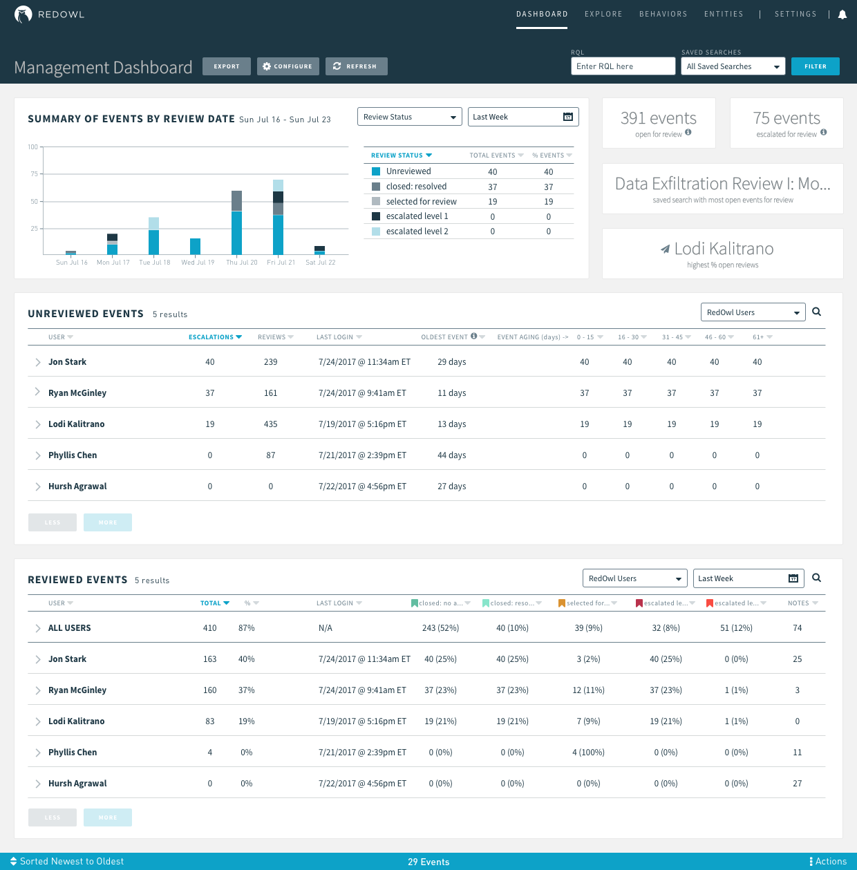
Management Dashboard
Date: July 2017
Role: Lead designer (ideation, research, wireframing, high fidelity design, prototyping, review, implementation guidance, client presentation, & feedback integration)
Duration: 2 weeks
The Problem
In the Compliance world, teams are required by law to review a random sample of “events” (communications, trade activity, etc) every year, which they do through RedOwl. Managers of these teams need an easy way to monitor the progress of the reviewers they oversee.
I worked closely with internal and external stakeholders at RedOwl to define needs, create designs, and implement a Management Dashboard to simplify to effectively solve this pain point.
The Solution
The Process
group brainstorming with product manager
solo brainstorming
whiteboarding & review
research, high fidelity design, review, & iteration
prototyping, review, & iteration
executive review & sign off
engineering kickoff & implementation
Group Brainstorming with Product Manager
High level conversations about a Management Dashboard had been floating around for months, until the feature made it to the product roadmap given the growing number of requests from clients. Once we were ready to kick off the project, I had a brainstorming session with the product manager (located in another office) where we reviewed the very high level requirements they had put together. I asked various questions to tease out additional requirements, smooth out some kinks, and get more clarity on the feature. We compared the main user of this Dashboard with the set of User Personas my team created to use as a rough guideline of user behavior. With that said, we try not to let our Personas replace our communications directly with clients. Along with the PM, we discussed the priority level (Must, Should, Could, Would) of the requirements.
Note: As RedOwl is a geographically distributed company, communicating clearly, efficiently, and often was extremely important. Throughout the process, I maintained a Confluence page accessible to anyone at the company with mocks, questions, decisions made, meeting notes, and more.
Solo-brainstorming
I tend to think in list form, so immediately following the brainstorming session, I wrote out what I would need to design, listing various things I planned to include and exclude, as well as questions that came to mind about behavior and needs. I did some light sketching here as well.


Whiteboarding & Review
I then set off to do some whiteboarding. We try to use atomic design, where we use small re-usable elements to build a larger picture; for example: buttons, a table, and inputs all come together inside a card, which can then be stacked on a page. I then sent photos to the PM and a small selection of internal stakeholders for initial review (I hold bi-weekly “Design Ideation” sessions with these internal stakeholders to keep a finger on the pulse of what clients are saying, feeling, and asking for as well as to update that team on design progress and upcoming features).
Research, High Fidelity Design, Review, & Iteration
During this time (and later in the process), I browsed my ever-growing catalog of design inspiration as well as some design websites (Dribbble, Behance, etc) for inspiration as I was sketching. From there I jumped into high fidelity mocks and explored a number of layout options (tabs, cards, toggleable tables, etc). After reviewing with the team, it was clear that one layout, with stacked and configurable cards, lent itself to the most flexibility and would be easiest for users to get the information they needed.


Prototyping, Review, & Iteration
I had various conversations, via Slack, client sessions, internal meetings, and one on one, that helped to evolve the Dashboard over about one week. Small tweaks were made until the internal stakeholders felt comfortable with and confident in the solution. I put together a clickable prototype using Invision (link here) and reviewed it with a few clients. The prototype was very well received and provided an excellent conversational tool. I made changes to the prototype based on this feedback and again reviewed with an even broader set of internal stakeholders, catching them up on the process, where we were, and what changes needed to be made.


Executive Review & Sign Off
In the monthly Design Studio I hold with our executive team to brainstorm and review upcoming work, we discussed the Dashboard in depth. It is important to bring all new stakeholders along for the design journey and to clearly explain why certain decisions were made so they can understand how we came to the solution we did, while still allowing those stakeholders to feel ownership of the product.
Engineering Kickoff & Implementation
Once we had final sign off, I held a meeting with the engineering team lead, architecture lead, and the engineers who would be working on the feature to review the work, answer questions, and determine feasibility of the work. I created a handful of high level JIRA tickets with mocks, specs, and behaviors detailed. I then worked with the front end engineers to break those tickets down into smaller sprint-worthy tickets for them to work off of.
At this point, the engineering process really took over, while I stood by to answer any questions or issues that came up during implementation. I created a Slack channel where our distributed team could casually chat about the feature implementation and get answers to their questions quickly.
See the project from start to finish below
Review Dashboard
Date: August 2016
Role: Lead designer (ideation, user research, wireframing, high fidelity design, prototyping, review, implementation guidance, client presentation, and feedback integration)
Duration: 1 month
Many of our clients are required by regulators to review a random 2% sample of emails every day. Prior to using our software, clients would open Outlook or other email clients and randomly click through until they reached an approximate number of emails. You can imagine users would come across many bulk emails from companies like 1-800-Flowers or others that are clearly not a threat.
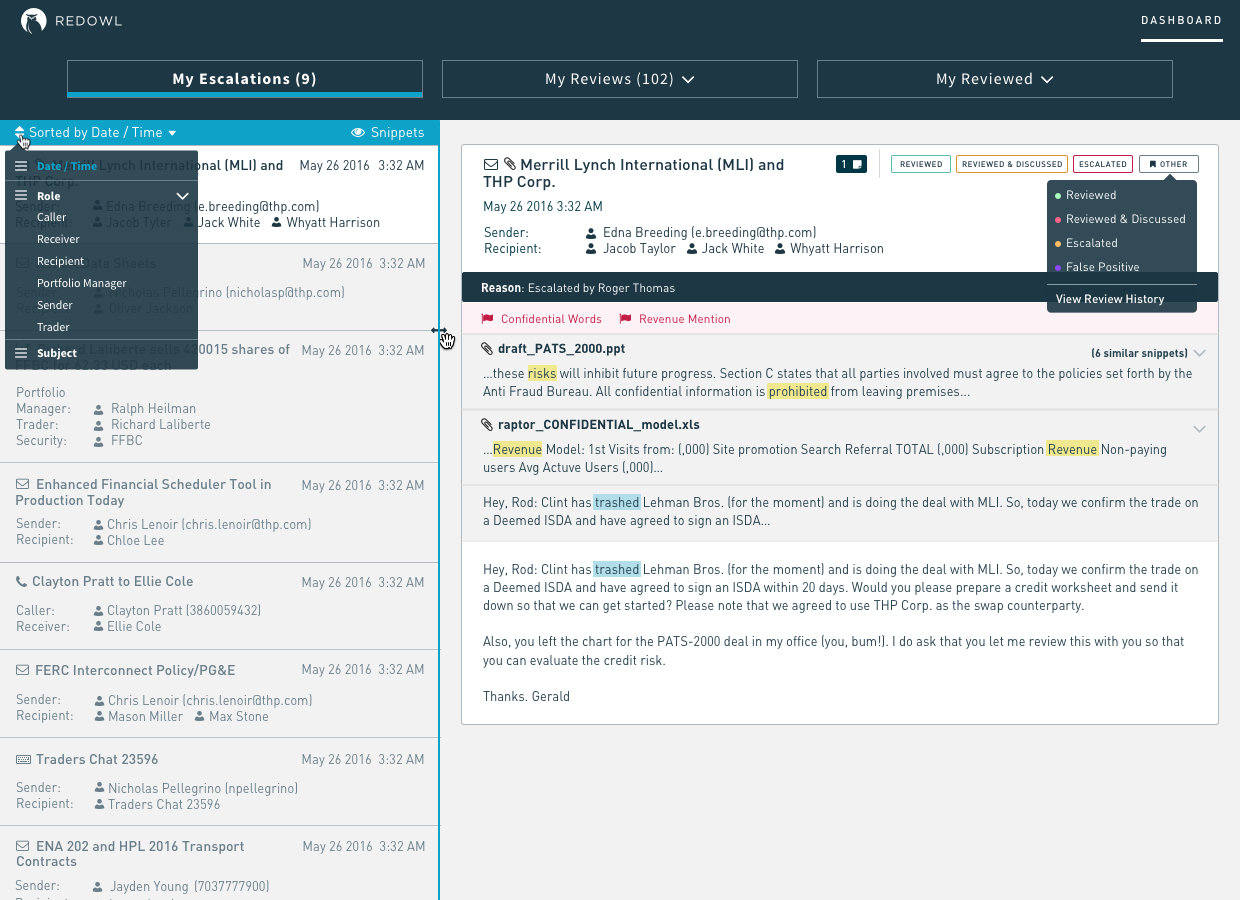


The Solution
Our software filters out noise using various analytics to present users with interesting emails while meeting their regulatory needs. This "Review Dashboard" enables users to quickly click through emails that have been flagged for review. We wanted to avoid forcing any sort of workflow, but allowed for a configurable workflow using review statuses. Reviewers can apply a review status (such as "escalated", "reviewed", "closed", etc) to each email, which then brings the next email into view automatically.

The Process
group brainstorming with product manager
solo brainstorming
whiteboarding & review
research, high fidelity design
prototyping, review, & iteration
executive review & sign off
engineering kickoff & implementation
Group Brainstorming with Product Manager
RedOwl’s first product was dedicated to providing a quick and easy way for users to review events on a Review Dashboard. However, the page was deprecated while we tried to shift users over to a more exploratory workflow (the “Explore” page). After a year or so, it became apparent that users needed a very explicit review queue that they could filter through quickly and effortlessly so they could get back to their other tasks (reviewers are not typically dedicated to compliance and are often trade group managers overseeing teams of analysts or traders).
Our product manager pulled together a rough cut of requirements in the form of user stories that we reviewed together. I asked various questions to tease out additional requirements, smooth out some kinks, and get more clarity on the feature.

Solo-brainstorming
I tend to think in lists, so immediately following this brainstorming session, I wrote out what I would need to design, listing various things on my mind, as well as questions that came to mind about behavior and needs. We try to use atomic design, where we use small re-usable elements to build a larger picture; for example: buttons, a table, and inputs all come together inside a card, which can then be stacked on a page. This gave me a starting point for my sketches that could build on each other to form the Dashboard. I sketched a few concepts and progressed on to some whiteboarding.


Whiteboarding & Review
The Review Dashboard would be one of our main Dashboards, complementary to our Analytic Dashboard. The user personas dedicated to each are similar in that they are each reviewing items, but one reviews people (Analytic Dashboard) and one reviews events (Review Dashboard). I drew out these concepts and listed the similarities between along with some questions to consider.

Research, High Fidelity Design
During this time (and later in the process), I browsed my ever-growing catalog of design inspiration as well as some design websites (Dribbble, Behance, etc) for inspiration as I was sketching. From there I jumped into high fidelity mocks and explored a number of layout options (tabs, cards, toggleable tables, etc).


Prototyping, Review, & Iteration
I had various conversations, via Slack, meetings, and client sessions, and one on one, that helped to evolve the Review Dashboard over about two weeks. Small tweaks were made until the internal stakeholders felt comfortable with and confident in the solution. I put together a clickable prototype using Invision (link here) and reviewed it with a three of our clients who were primary drivers of the new Dashboard. The prototype was very well received and provided an excellent conversational tool. I made changes to the prototype based on this feedback and again reviewed with an even broader set of internal stakeholders, catching them up on the process, where we were, and what changes needed to be made.
Also during this time, I reviewed with the Engineering team to asses the level of difficulty and whether everything we were thinking about would be feasible. There were a few adjustments we needed to make to ensure performance wouldn’t suffer, by loading a long dropdown of entities and event counts, for example, but overall the engineering team was bought in.
Clickable Invision prototype here
Executive Review & Sign Off
In the monthly Design Studio I hold with our executive team to brainstorm and review upcoming work, we discussed the Dashboard in depth. It is important to bring all new stakeholders along for the design journey and to clearly explain why certain decisions were made so they can understand how we came to the solution we did, while still allowing those stakeholders to feel ownership of the product.
Engineering Kickoff & Implementation
Once we had final sign off, I held a meeting with the engineering team lead, architecture lead, and the engineers who would be working on the feature to review the work, answer questions, and determine feasibility of the work. I created a handful of high level JIRA tickets with mocks, specs, and behaviors detailed. I then worked with the front end engineers to break those tickets down into smaller sprint-worthy tickets for them to work off of. At this point, the engineering process really took over, while I stood by to answer any questions or issues that came up during implementation.


See the project from start to finish below
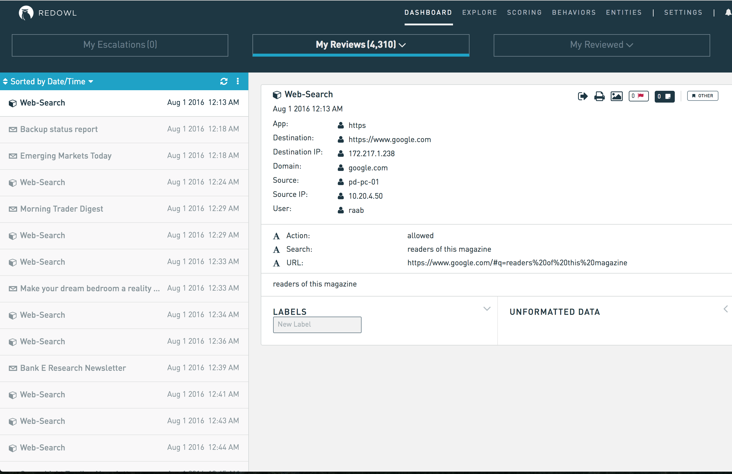
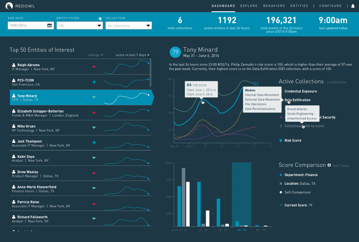
Analytic Dashboard
Date: June 2016
Role: Lead designer (ideation, user research, wireframing, high fidelity design, prototyping, review, implementation guidance, client presentation, and feedback integration)
Duration: 6 weeks
The Problem
Until the 2016, RedOwl’s primary focus was on serving the regulatory surveillance client with tools like the Review Dashboard and the ability to Explore entity communications. In 2016, we made the decision to move more into the information security space, but needed a way for Security Analysts to monitor the risk levels of their organization by entity, rather than by communication events as we had done previously.
The Solution
We created an Analytic Dashboard to pull details about high risk entities and the analytic models they were scoring on together in one view so users could essentially have a queue of entities to review. Clicking on any entity would give the user an idea of who that entity is and why their score may be high. The entities are ordered by risk based on analytic models that flag on different activities, such as wall crossing, data exfiltration, etc. Users can interact with the visualizations to see more information about the models and the entity in question. This dashboard enabled RedOwl to enter the information security space and brought with it a whole new set of users with completely different needs.


The Process
The design process for this feature was somewhat quirky. We had an important conference that we wanted to show off our new Dashboard for so we quickly pulled together requirements, sketches, designs, and a prototype, built the feature, and then circled back in a full day product discovery session that I led to evaluate where we stood, where we wanted and needed to go, and what we could learn to iterate on our first pass at the Analytic Dashboard.
initial review with product manager
sketching & whiteboarding
high fidelity explorations
whiteboarding & review
wireframing
high fidelity design & prototyping
executive review & signoff
engineering kickoff & implementation
conference review
product discovery session with executive team
Initial Review with Product Manager
Our product manager pulled together a rough cut of requirements in the form of user stories that we reviewed together. I asked various questions to tease out additional requirements, smooth out some kinks, and get more clarity on the feature.
Note: The requirements on this feature were quite ambiguous and not “complete” until as late as the implementation stage. Design was mostly used as a conversational tool to help drive decision making around certain ideas.

Sketching & Whiteboarding
Generally speaking, the information security side of the industry has much more user friendly interfaces than compliance. After compiling my list of things to consider, I browsed my ever-growing catalog of design inspiration as well as some design websites (Dribbble, Behance, etc) for inspiration, sketching as I went. As I soaked in potential design ideas to include, I sketched various potential layout options, features to include, etc.
I knew that as a dashboard that would be showcased at the upcoming conference and, more importantly, as the new player on the block, we had to create a dashboard that was visually pleasing and intuitive to use. I sketched a few concepts and progressed on to some whiteboarding.


High Fidelity Explorations
After sketching some options, I moved to create various high fidelity mocks exploring different layouts, styles, and features. We try to use atomic design, where we use small re-usable elements to build a larger picture; for example: buttons, a table, and inputs all come together inside a card, which can then be stacked on a page. This gave me a starting point for my mocks that could build on each other to form the Dashboard. I reviewed with various members of our internal team and it became clear that there were a number of ways we could go with this dashboard.


Whiteboarding & Review
As the information security space was new to us, it was important to ensure our team was aligned on what we wanted to build. I flew to San Francisco to meet with our VP of Product and Product Manager and to lead a mini Design Sprint with them. We started by reviewing the user, their needs, and how we planned to solve their needs. We then did some group brainstorming on the whiteboard before breaking off individually to do some sketching. We came back together, reviewed each of our ideas, and evaluated the benefits and drawbacks of each. We circled around again to do another round of sketching given what we had learned from our first session.


Wireframing
From there, I took what we had created and made some wireframes using Balsamiq. I reviewed these wireframes with various internal stakeholders to work out some additional kinks, relying heavily on our pre-sales team who had the most experience working with information security customers.


High Fidelity Design & Prototyping
I worked in feedback from this team and moved on (again) to high fidelity mock creation. I iterated on these mocks for the next week, created a quick clickable prototype, and reviewed constantly with our internal team and with clients whenever possible.


Executive Review & Sign Off
Because of the quick deadline, I reviewed design progress early and often with the executive team. It was great to get almost immediate feedback on my work so that no time was lost between review sessions. After a few iterations, we had official sign off on the dashboard’s MVP.
Engineering Kickoff & Implementation
Again, because we were on such a short deadline to get this dashboard built before the conference, we had kicked off the feature with the engineering team before the design had been finalized. They began on the page architecture and some of the components that we had finalized. We were designing and building in parallel, but finally reached an MVP design that the team agreed on. I fleshed out the priorities of specific parts of the dashboard for the team to build and in the end, were able to meet the deadline and build the dashboard in time for the conference.

Conference Review
The brand new Analytic Dashboard was very well received at the conference and we had many prospect meetings set up to discuss working with us, specifically on the information security side. However, making the jump into the information security space did not happen overnight. We knew there was still a lot of work to be done to get the Dashboard (and workflow) to where we wanted it to be before officially signing on any information security clients.

Product Discovery Session with Executive Team
I led a full day product discovery session with the executive team and some key internal stakeholders to tease out the real users in information security, the needs of the new user we were trying to cater to, and the types of products they were using previously. I put together an agenda, taking key principles of Google’s Design Sprint and boiling them down to a few hours instead of a few days. Our CEO opened the session with his vision on where we want to be in the space and what we might need to get there.
I had pulled together some information security-specific user personas and key user stories, which I reviewed with the team to ensure we were all on the same page. I then led the team in brainstorming ideas about what the main user’s needs were. We pulled together some concepts and workflow ideas before I invited our pre-sales team focused on information security to come in. We interviewed each of the four members of that team about what they were seeing in the field and what was being asked for to learn more about what we were up against. The afternoon session reconvened to reevaluate where we stood after the interviews and to reconsider our original hypothesis, update user needs, etc.

See the project from start to finish below
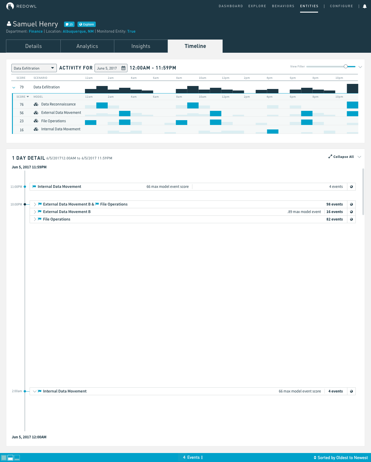
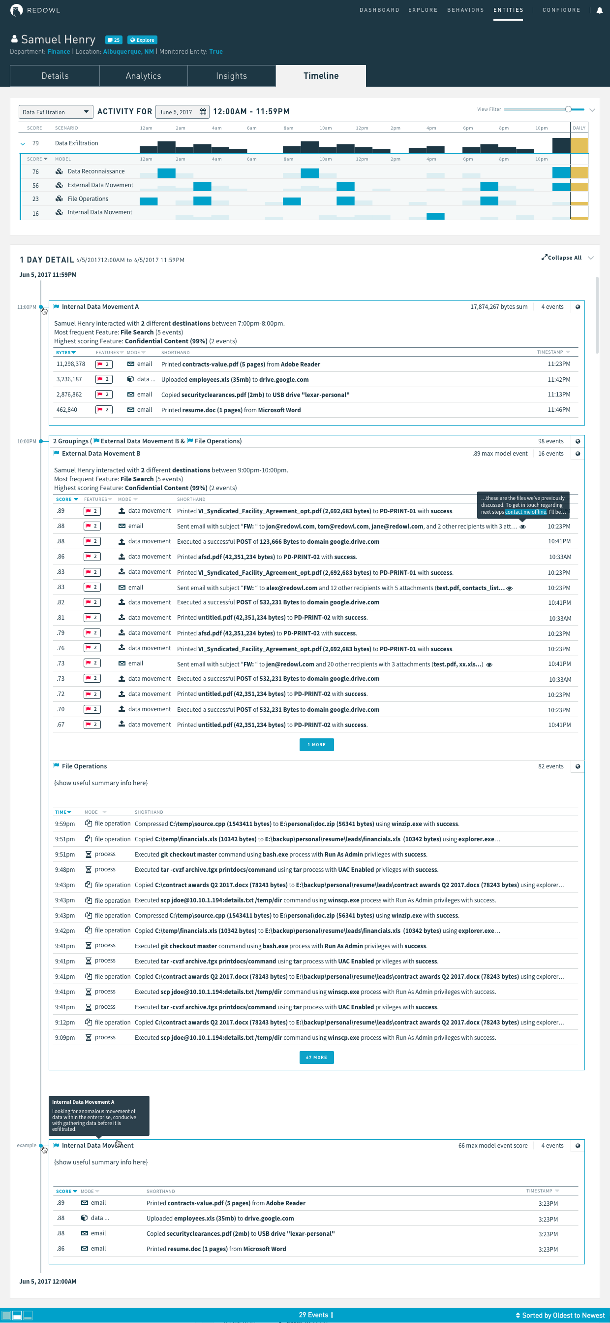
Entity Profile Page
Date: June 2017
Role: Lead designer (ideation, user research, wireframing, high fidelity design, prototyping, review, implementation guidance, client presentation, and feedback integration)
Duration: 6 weeks
The Problem
Because of the tight deadline we had when building the Analytic Dashboard's MVP, we picked an existing page in the application that would be sufficient enough for the user to click through to to take the next action. We picked our Behaviors page, which is essentially a heatmap of activity by Entity with very limited filtering ability. This workflow was not ideal, and we knew this from the beginning, but we used it anyway to get the MVP released into the wild. Users wanted to be able to see context about entities to learn who they were, what was “normal” for them, and what kind of behavior they were exhibiting that caused their risk score to increase.
The Solution
We had Entity Profile pages in the application, but they were built with legacy code, were very hard to maintain or update, and did not provide sufficient enough information for users coming from the Analytic Dashboard. With this, I set out to define requirements for a new page and then reviewed with the product manager.


The Process
stakeholder discussions & requirements gathering
sketching & whiteboarding
wireframing
high fidelity mocks & review
executive review & sign off
Stakeholder Discussions & Requirements Gathering
This feature was driven by design & engineering, rather than by our product managers. I led the charge by working with various internal stakeholders to collect requirements for the new Entity Profile page. I also pulled together a list of existing issues and bugs with the old Entity Profile page to determine if we needed to fix any of those items with the refactor and redesign. I then reviewed these requirements with a broader group, including the product manager, and with a few clients to validate the requirements.

Sketching & Whiteboarding
I turned pretty quickly to sketching and whiteboarding, sometimes collaboratively with remote team members (Zoom / video calls are an amazing thing), to gather feedback as quickly as possible.


Wireframing
I created wireframes to explore some of the concepts I had sketched in order to review these slightly more tangible mocks with stakeholders. After iterating here, I turned to high fidelity mocks.


High Fidelity Mocks & Review
I explored a number of options here, both to display the information visually differently and to offer various options for the engineering team. Essentially, I designed a mock for each low, medium, and high level of effort so that we could choose one based on how much engineering time we had to dedicate to the new page.


Executive Review & Sign Off
I held two Design Studios with the executive team to review the progress on the new Entity Profile page, between which I was able to make revisions. After receiving final sign off, we moved quickly on to implementation.